Showing posts with label 2u Creative. Show all posts

Friday, September 27, 2013

E-Blasts In Demand


Here at The 2u Collection we admit that our obsession for paper is grand! Parchment, Linen, Cotton, Vellum -- Textured, Matte, Mylar, Foil -- the Weight, the Color, the Feel... all just absolutely fascinating.  However, not always does an occasion call for a “physical” invitation piece.  
Enter the E-Blast Invitation!! 
Recently and in partnership with our branding and marketing division 2u Creative, we have seen an upturn in our development of not only E-Blast Invitations for clients, but also E-Newsletters and additional email based marketing materials.

While we have a natural passion for paper and have gained an all-new appreciation for the flexibility of the E-Blast, it is important to understand that the E-Blast isn't always appropriate. Formal events should stick with tradition and use a paper invite that is sent through the mail. However there can still be a place for the E-Blast in even the most formal of events such as reminders to book hotel arrangements or to share an Itinerary.

Here are some examples of great times to use an E-Blast:
  • A last minute event pops up and you have limited time to send the invites
  • You’re working within a budget and your event doesn’t call for a formal invitation
  • The invite or information needs to be sent to a large mass and quickly
  • A time sensitive promotion your clients would love has begun and ends soon
  • Going GREEN and decide this will cut down on paper costs

Take a look below and see how E-Blasts can be effective yet styled, in a variety of forms:


Bachelorette Party


Wedding Reminder


Rehearsal Dinner


Promotional Newsletters


Party Invitation


Additionally, E-Blasts created by The 2u Collection and sent through our email marketing system, can provide several useful features including:

  • Email reports and tracking results
  • Insight on how recipients marked your email (spam, subscriptions, relevance)
  • Feedback regarding client interests and targeting techniques
  • Matching your e-blast branding to your website branding
  • Financial, economic and environmental advantages

Wednesday, May 22, 2013

Correspondence with Flair


Recently we addressed the importance of keeping the handwritten thank you note alive.  As we worked on embellishing Invitations, Holiday Cards, and Thank You’s throughout this busy season a thought evoked… writing can be mundane BUT embellishing is always an inspiration for excitement, for both the giver and receiver.

So the next time you sit down to write a letter or feel uninspired consider the following ways you can spice it up… add a touch of character… and express your personal style!  You might find that looking forward to the details may awaken the purpose of your correspondence and even influence a theme.


Embossing Press
In creating various stationery projects for our coveted client Florida Hospital, we were inspired to design this embossing press featuring the Florida Hospital logo.  The result was a piece of class!  We loved the touch so much that we designed a piece for ourselves here at The 2u Collection and we just couldn’t stop pressing our logo onto all types of surfaces once we received it!! An adornment like this can be customized with a logo or graphic to fit most any need! - Check out theStampMaker.com


Envelope Enhancements & Pristine Packaging 
Envelope liners, wax seals, color corrugated shipping boxes and custom designed labels add a unique elegance to any mailing!

Courtesy of TheWeddingPhile.Blogspot.com

Gorgeous envelope liners can be found for almost any size at Paper-Source.com - From solid colors to fine prints, liners add that finishing touch... much like a fabulous lining on a tailored jacket or cuff!


Something as simple as changing the color standard on packaging can really act to catch the eye.  Give the brown box a lift and go for a bold color, or take it a step further and choose unique shapes and sizes.  Take a browse around USBox.com for a plethora of packaging!!


The timeless wax seal needs little explanation...  It's clean, elegant and speaks volumes as you seal each envelope with care and sincerity.  At Nostalgic Impressions they create polished & personalized wax seals that make us swoon!


A Pop of Color... A Taste of Texture
Colored envelopes and textured papers will change the entire feel of a correspondence piece while adding impact to that stack of junk mail! Even here at The 2u Collection our eyes spark and open wide when we catch a rouge within the pile... and of course, it's the first we chose to open and admire!!


Have you ever experienced that moment when writing or creating a thoughtful piece, where you just couldn't wait for the recipient to open?! Oh the anticipation!!! Well, there are times when the excitement is all too much and you boldly take an unconventional approach, much like that featured above. This client was so full of joy in announcing their new edition, that they simply had us print a lovely portrait right on the envelope -- Secrets Out!!


As we sift through the mail texture stands out to the touch!!  The columned paper featured above is sure to impress.  Play with different paper types and treatments to evoke a variety of feelings.  Neenah Paper is one of our favorite paper pros but check out Paper Mojo as well for decadent handmade papers!


Stuck & Stamped
Both of these are cute and quirky ways to add a bit of personal whimsy & cultural flare! -- You can layout, design a nice label & stamp or print right on the envelope.

Courtesy of IntimateWeddings.com

We just love this! Try buying stamps in small denominations and then placing them creatively on the piece to create a fun and traveled feel. Pick up stamps as you explore the world or hometown. Check out vintage and antique shops... alot of the time they'll have these treasures tossed amongst old photos and such!


Courtesy of GourmetInvitations.Blogspot.com


A custom ink stamp like the one we created above not only acts to adorn a mailing piece, but it can also be held as a keepsake and used time and time again on a variety of creative indulgences.  - OrlandoRubberStamps.com produced our design flawlessly!


In hopes that you are inspired to create!!  For more ideas visit us on Facebook at The 2u Collection

Monday, March 26, 2012

International Prostate Cancer Foundation Gala

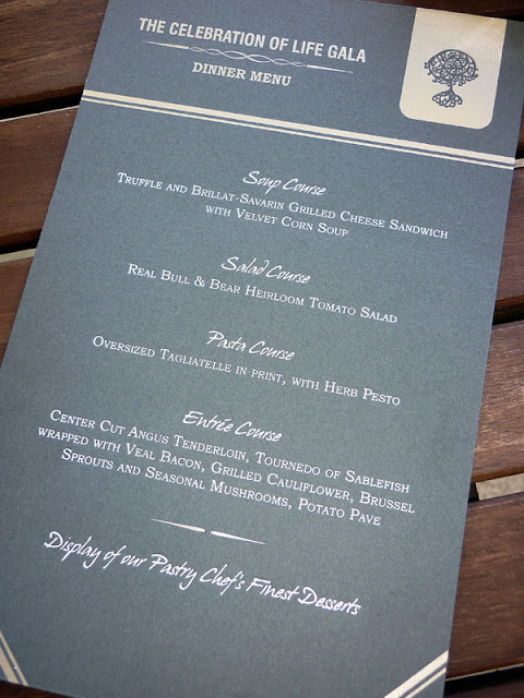
If you are a frequent reader of my blog you are well aware that a good portion of this month's efforts have been dedicated to the success of the International Prostate Cancer Foundation's Gala. I was first approached by the foundation to do all their marketing and our 2u Creative division had the pleasure of not only developing their foundation branding and website but I was able to hand over the next portion of the responsibilities to our stationary division, The 2u Collection. Having a stationary division is particularly beneficial for projects such as these where a client needs a vast array of marketing services including print materials, website design and brand conception and also stationary needs for a social event. Being able to work within my two divisions allowed for a seamless execution for all print materials, website and marketing materials to be unanimous with the stationary for their Gala.


The average person does not know that prostate cancer is actually a genetic familial disease. That is why from the very beginning of the design process the tree was such a focal point. With the design of the Gala materials we wanted to keep the tree as a focal point, but obviously with any social gathering, items should look more formal and have a different aesthetic value than that of marketing collateral.


The first design decision was choosing a color palette. The monotone array of greys, silvers and charcoals really made for an elegant statement. I was able to incorporate the tree in a more formal way by using silver and white foil stamping on a Neenah classic linen charcoal paper for the programs, place cards and menu cards. The tree was used on the cover of the IPCF program as well as inside the program, that paired with a stripe corner border were the two design focal points of all the stationery pieces. All the items were classic and timeless and although appealing to the women's eye were designed with a masculine look in mind. We really wanted to keep it masculine so the materials suited the overall goals of the foundation in who they are reaching.


 The design collaboration with Lisa Stoner of E Events really brought out the beauty of what we had created. The tables were dressed in green table linens, each had a lush floral centerpiece and clear glass gold beaded chargers. When menu cards, place cards and table numbers were placed on the tables, paired with the individual table pin-spotting the details of the pieces really came alive.


The grand finale of this event, like any were the favors. The foundation selected to hand out individual tree seedlings that each had a tag designed by The 2u Collection describing the meaning behind the seedling. Each guest was invited to take this seedling home and plant it in their own yard in honor of someone who has or is currently battling prostate cancer. This touch really put a memorable emphasis on why the tree was the focal point for the event and the foundation itself.


The event was one of the most rewarding I have ever had the opportunity to work on. Not only were both of my divisions contributors to the overall design and success of the event and the IPCF brand itself but I personally am continually touched by the efforts of Dr. Patel. I am honored to be part of the journey IPCF has begun and look forward to all the projects we work on together in the future!  


Of course there are so many people involved in helping execute this, but I want to give so much thanks to Lawton Printers. Not only are they amazing at what they do, they treat their customers like family and will move heaven and earth (if needed) to turn my designs and ideas into beautifully printed finished pieces! Another big thanks to Jeffrey Stoner of Stoner Video for supplying all these beautiful images!

Tuesday, June 28, 2011

A Sneek Peak of what we are Currently Working on..

Okay I know it's been a while.. I'm ashamed. But it is wedding season and we have been busy giving our absolute best to our current brides and their weddings!!  We try our best to give the attention deserved to each event and sometimes that means I fall behind on catching up with all of you wonderful readers.  


But Wedding Season does NOT mean work stops in our other division 2u Creative!!  So, I wanted to give you a sneak peak of what we are working on.  Earlier in April we were happy to welcome Kelleen Hite of Pure Sugar Studios as a client! She loved all the brand development (to view this see below for links to past blogs) I've done for Abby Liga of Liga Photography. and wants me to re-brand her!! Thanks Images for a Cure Workshop for letting Abby RAVE about me in her Workshop!


So we've been busy working on getting her new website up!!  Below is the Teaser Coming soon page we've created.. and I also wanted to share the custom icons we illustrated for the site.. 


Stay tuned we hope to launch her new site by August 1st, and we will be sure to announce it when we do!!


Please comment and let us know what you think so far!!


This is the Current Teaser page up at PureSugarStudios.com


Custom icons we illustrated for the site. Please comment and let us know what you think!


Links to see the branding work we've done for Abby Liga.  and PS.. an updated look is in the works for her as well!! Her website is done in the new look, and we are working on a NEW Editorial Magazine Style Brochure, you can see a sneak peak of the new look on the first link below.


A New Look for Liga!
The Liga District.
Look What we Accomplished!
Lawton's Printer, The Liga District and 2u Collection Successful Collaboration!


Interested in Branding and Why its so important?  Check out these previous posts on the subject!

The Importance of Branding & Advertising- PART I

Thursday, January 13, 2011

What we've been up to in our Advertising & Marketing Division.


As many of you know we have an Advertising and Marketing Division here, 2u Creative, this is the world I came from before I branched out and started the invitation side of things.


Last year we had alot of projects going on in this division, and I'm going to do my best to blog throughout this year about some of these amazing projects we had the opportunity to create!


I'm starting off with one of my favorites. This client is amazing in many aspects!! First she does my hair, and I must say I've never had a bad hair day (Thanks to her! :))  And she was also one of my brides for last year. So you'll see me blog about her invitations sometime soon as well.


Our goal in this project was to brand her as an independent stylist.  I think we did a good job, and Kim was extremely happy with the result. We created Promotional Mirror Hangers, A Service Menu, Appointment Cards, Direct Mail Pieces, Gift Certificates and Business Cards, as well as sending out Eblast Marketing on a regular basis.


Wednesday, August 25, 2010

Lawton's Printer, The Liga District and 2u Collection Successful Collaboration!


Most of you know that I handle the marketing & branding for Liga Photography and their Commercial/Portrait Division The Liga District.  Last year, we embarked on a fun project. Developing the brand and identity for The Liga District. I did the design and art direction, of course amazing photography by The Liga District, and we called on Kim of Lawton's Printer for the printing & production!! So we created a Launch Campaign, and as you see by the images it turned out great!!  It is Soft Touch Aqueous Coating with Spot UV.  It is one of the favorite pieces I have in my bag of experience, and I've very proud of it. Join me in congratulating Lawton's.. Among Many awards they received that night, the campaign I created for The Liga District won Best in Show for a Campaign.


See the press release below!


Lawton Printers Top Honors in Statewide Print Competition
Orlando, Florida, August 8, 2010 - Lawton Printers received awards for all entries at the 2010 annual Florida Print Awards, the printing industry’s largest and most prestigious statewide graphic arts competition. The Printing Association of Florida (PAF) presented the awards to elite Florida-based printing and graphic arts companies during a banquet on August 6, 2010 at the Loews Royal Pacific at Universal Orlando.

With hundreds of entries from printing and graphic firms across the state, Lawton Printers received six Best of Category Awards, four Awards of Excellence and one Judges Awards, plus the prestigious Trophy for Best Process Color Printing and a Trophy for Best of Show Division I.
“Other companies can talk about quality – we know we produce outstanding quality. And it’s reflected in our wins,” said Kimberly Lawton Koon, President. “Our employees work very hard to give each project same attention and care, and winning the overall Best Four Color Process Printing trophy is very gratifying for all of us at Lawton Printers.”

George Ryan, president and CEO of PAF, added “year after year, the quality of the submissions for the Florida Print Awards increases, raising the standard to which they are held. It seems like we say this every year, but the judges remarked how they were, once again, impressed with the entries submitted by PAF members and also said this year’s competition was the toughest yet. Lawton Printers should be very proud of their outstanding accomplishments.”
The Florida Print Awards is the printing industry’s largest statewide graphic arts competition. It recognizes individuals, companies and organizations responsible for the creation or production of print communications. The competition promotes excellence in the industry and recognizes companies and individuals who produce the best in print media.

About Lawton Printers, Inc.
Lawton Printers, founded in 1900, is an award-winning offset and digital printer providing solutions for customer’s high quality marketing and print needs. Lawton combines state-of-the-art technology & equipment with the heritage of 5 generations of excellence.
To learn more about Lawton, please visit www.LawtonPrinters.com. To learn more about Printing Association of Florida, visit www.flprint.org.


It’s an honor to be recognized by the industry as a company that produces top quality, award winning materials,” said  Kimberly Lawton Koon, President. “The entire team at Lawton Printers works on every project as if it were an award-winning piece.”


For more about these awards and Lawton Printers, visit www.LawtonPrinters.com